Learning data science with COVID19
Some thoughts on the importance of data and science of data science
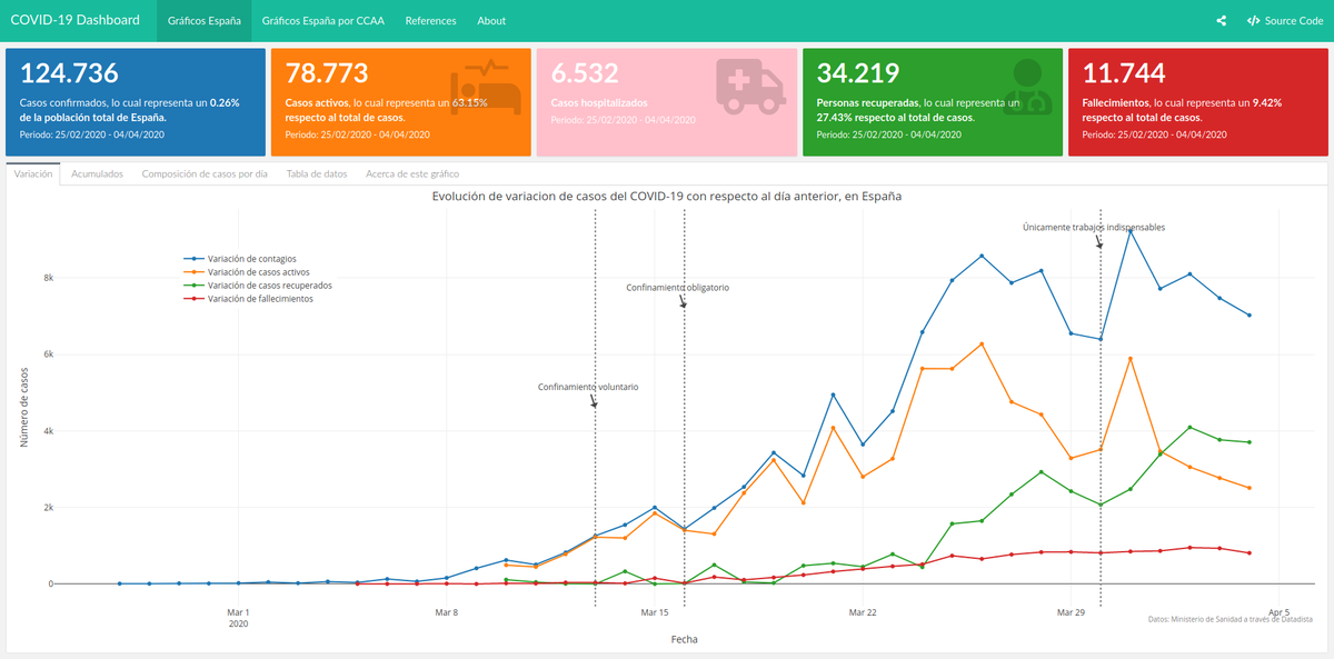 Yet another COVID19 dashboard. But I love it because it’s mine
I confess: during these days of lock down, I have toying with dashboards and infographics about COVID19 outbreak, just like everyone else. And I am not ashamed to admit that I am proud of the results I have achieved: I have made an interactive dashboards with nice plots, some formatted tables and even some (basic) maps. Everything with a few lines of code1. And yet, it is flawed. And yet, I will keep improving it. And yet, I am afraid it will always be flawed and, therefore, it will never be useful. Just like everyone else’s (or almost). But I know it is not me, it’s the data.
Why, then, am I persisting on keeping working on it if I know I cannot change its fate? A short answer could be “I do it because I can”, but that would not be completely honest. Admittedly, at some point I asked myself that very question and I even considered quiting. Not only I didn’t want to lose my time (even in these days where we are locked down at home there are plenty of things we can do), but I didn’t want to contribute to generate noise, missinformation and even more dramatism ti an already important drama. Because that’s what flawed graphics do. But in the end, I realised that working on a dashboard like that could be a great opportunity of learning by doing.
Starting from the most obvious: at a personal level, I have learnt a big deal of new techinical skills that I didn’t have just a week ago. To be more precise, I have learnt:
- To create a nice dashboard with some interactions within a single
rmdfile usingR'sflexdashboard - To host and deploy the dashboard using github pages, just by committing and pushing to my github’s repo
- To use
plot.lyfor interactive plots instead my good oldggplot2, which I have come to love. This is something I had wanting to do for quite a long time but I had never had the chance nor the time for testing it. - To create nice interactive tables in order to make them more readable.
Something here
At the time being, the dashboard’s source code has 523 lines in two files: one for data gathering and another rmd file with the dashboard. ↩︎
Carlos Cámara-Menoyo
Architect. PhD. Lecturer. Life-long Learner. Transdisciplinary.
I love learning, teaching and researching, as well as sharing and visualizing data, specially with maps. I have a technical and social background and my multiple research interests are centered around the commodifications between cities, technology and society within informationalism and free culture paradigm. So far, I have applied that approach on the topic of social and spatial inequities.